File Cabinet Friday #3: The Star Trek Font
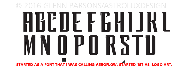
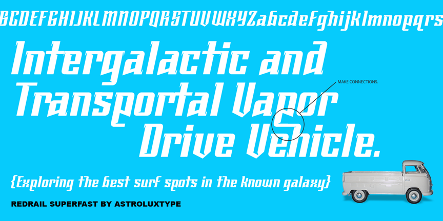
As I have been told by a few colleagues people love seeing process, so this post is in regard to my font (linked here) Redrail Superfast becoming the logo for the legendary television series reboot of the Star Trek franchise on CBS TV next year in 2017. The font is used throughout the film teaser/spot. Below is the pencil stage where I started which before that it was most likely a logo design for DC Comics as I have done many projects for them over the years, and will re-purpose those on occasion for other uses. Often a few glyphs will be the beginning for something to be explored further, more often than not these are abandoned, but sometimes lead to a whole font. The third image is a poster promo for myfonts.com that showcases the design in use. These posters are a way to suggest uses and present ideas as to how the font will look in client projects. You can see the video announcement here and here is the second TV teaser released in July 2016.

![]()