File Cabinet Friday #4
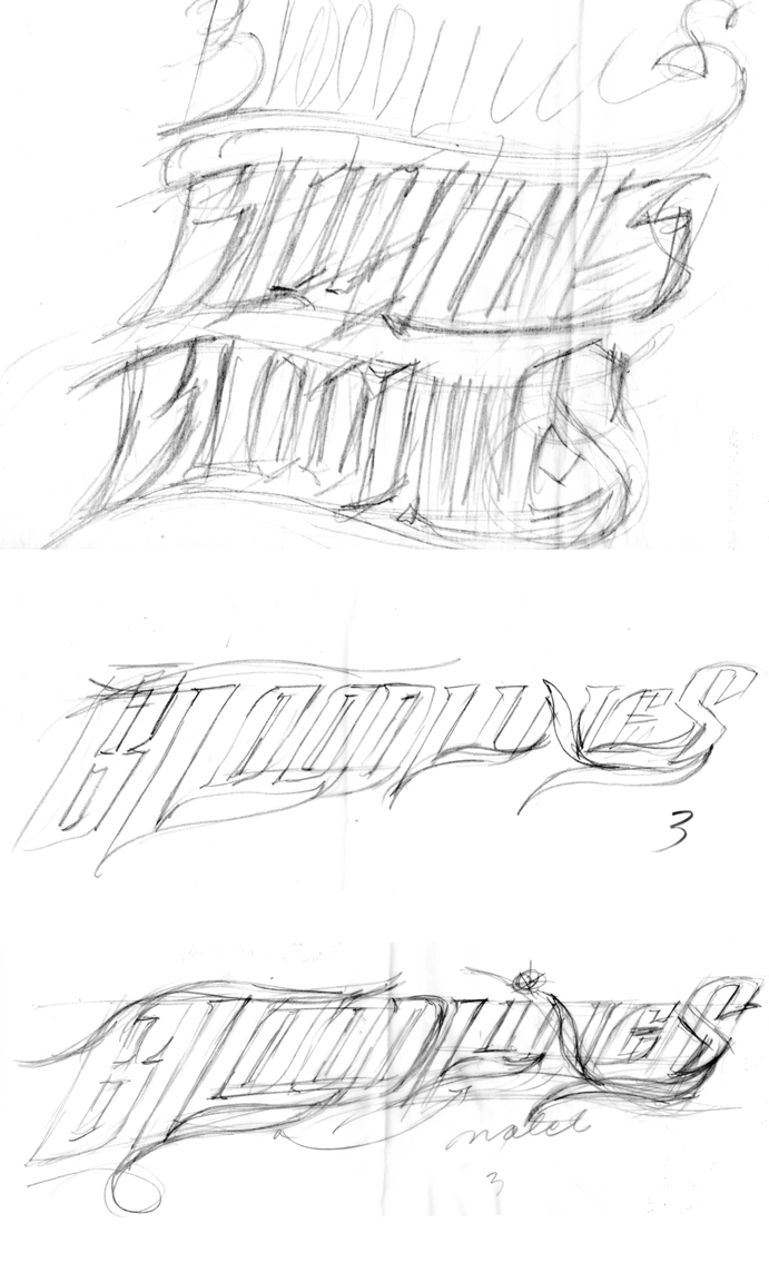
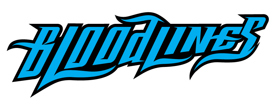
This logo for DC Entertainment shows the very rough pencil to tighter pencil to the tighter (but in process) illustrator file. This design was rejected for the book, but I thought it could turn into something interesting. There was still much work to be done on the last stage, as glyphs needed work and resolution to the forms. The sketch has the uppercase D then I used lowercase to solve what I thought looked better, but it stands out now as problem to be resolved.

